Creating a logo for a luxury eco-wedding and celebration cake company
Finding a designer who shares my core values
The Designer
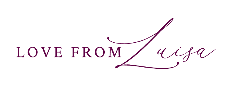
The first step in creating the perfect logo that represents my luxury eco-wedding and celebration cake company ‘Love From Luisa’ was finding a designer who shares my core values. They also had to have an aesthetic that matches my brand identity for luxury cakes, created sustainably. I found Meg Harrop of Lemon and Birch via her beautiful designs on Pinterest. I was immediately taken by her hand drawn designs that are both high end and unique. She also ticked all my boxes in terms of ethos and style. She is an independent designer and a female entrepreneur who creates thoughtful designs for high end brands.
The Inspiration – art direction
The mood boards give an indication of the luxury style I want to convey in my designs.
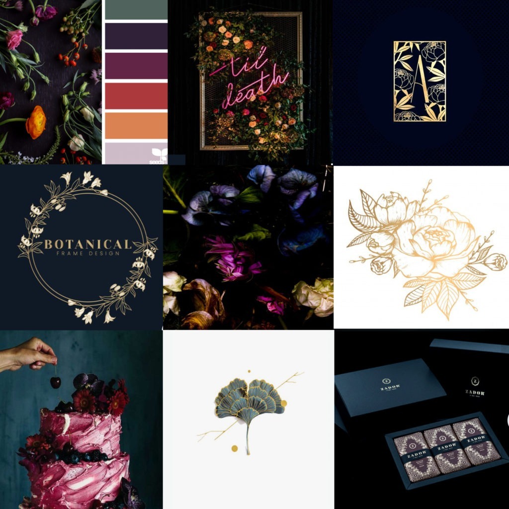
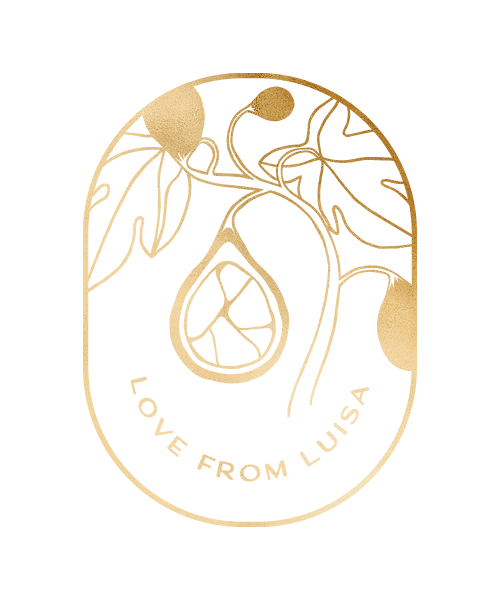
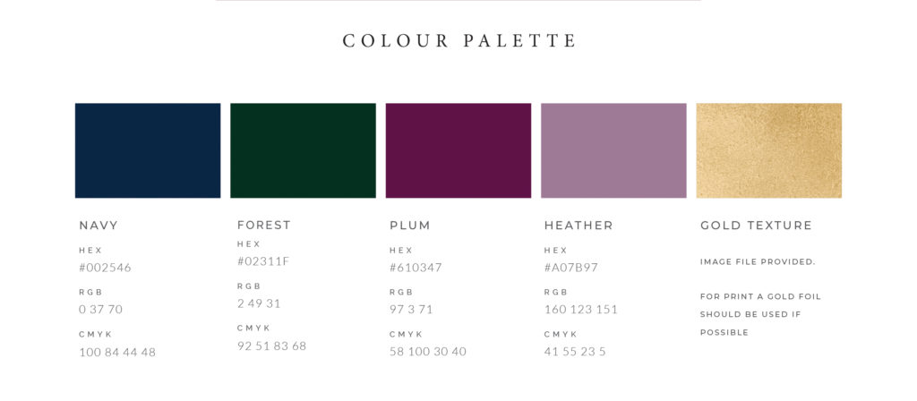
The overall intention for my brand identity was to create a feeling of opulence and luxury whilst incorporating botanical elements to conjure up natural imagery that represents my sustainability ethos. This intention also had to come through in the logo design. I shared my art direction work and Pinterest boards with Meg so that she could get an idea of our brand. I also shared with her my ideals for sustainability and examples of my cake designs. The colour palette served as a strong base and background for the designs whereas the mood boards were developed that give an indication of the luxury style I want to convey in my designs.
Symbolism – Kinsugi fig & botanical vine
I wanted the logo to symbolise the ideals of my sustainable cake business and Meg managed to do this with style. She took my notes and inspiration from the Japanese art of kintsugi, the fixing of broken ceramics with gold lacquer, and cleverly incorporated it into the design of the fig creating a logo that represents my brand perfectly. The final logo has botanical elements, whilst also incorporating the kintsugi aspect of the design seamlessly in a thoughtful and interesting way by adding it to the cross section of the sliced fig.
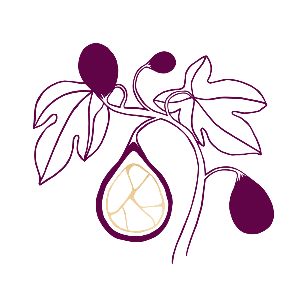
Meg took my notes and inspiration from the Japanese art of Kintsugi. The fixing of broken ceramics with gold lacquer.
This philosophy around kintsugi resonates with me on many levels. It shows that with care and attention a broken object, destined to be ephemeral, is given value and meaning that go beyond its original worth. This is a great metaphor for our planet and the ways we can begin to add value to our broken systems. By carefully considering our environmental impact today we can leave the world in a better state for the future.
The fig and vine leaves represent abundance and plenty. The fig is often used as a symbol of new beginnings and new connections, something I feel especially drawn to in these times. I feel that gratitude for the abundance around us is important to return to over and over, no matter the state of the world.
Meg took all of my (many) ideas and created a beautiful design that represents the core values of my sustainable cake business whilst also symbolising new beginnings and abundance that represent Love From Luisa perfectly.
Thanks Meg!