Creating a logo for a luxury wedding cake brand

Luxury Wedding Cake Brand
Creating a logo for a Luxury Wedding Cake Brand
The first step in creating a logo for a luxury wedding cake brand was finding a designer who truly shared my core values. And could therefore create a logo for my luxury cake company. Moreover, the designer’s aesthetic needed to align perfectly with my vision for a luxury cake brand. Consequently, I discovered Meg Harrop of Lemon and Birch through her beautiful Pinterest designs, and her hand-drawn artwork immediately captivated me—sophisticated, unique, and elegant. Beyond style, Meg also matched my ethos as an independent female entrepreneur who creates thoughtful designs for high-end brands.
Creating a logo for a luxury wedding cake brand
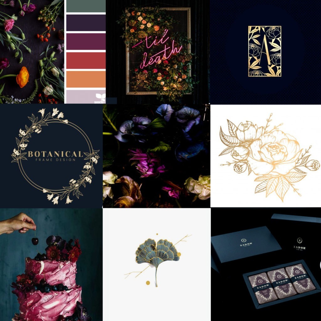
To begin with, the mood boards I shared clearly showed the luxurious style I wanted for my brand identity. Specifically, my goal was to evoke opulence and refinement while incorporating botanical elements reflecting our sustainability values. This vision, therefore, had to be woven seamlessly into the logo design. To help Meg understand our story fully, I shared art direction, Pinterest boards, and examples of my cakes. Additionally, the colour palette provided a strong base, while the mood boards guided the sophisticated luxury aesthetic I desired.
The mood boards give an indication of the luxury style I want to convey in my designs.
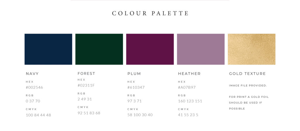
Symbolism — Kintsugi Fig & Botanical Vine
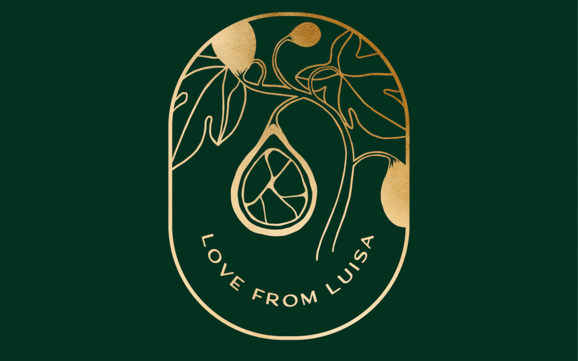
For the logo, I desired symbolism that encapsulated the essence of my sustainable cake business, and Meg brought this vision to life with remarkable style. Drawing inspiration from the Japanese art of kintsugi—the delicate repair of broken ceramics using gold lacquer—Meg incorporated this philosophy into the fig design. The final logo features botanical elements alongside the kintsugi motif, beautifully integrated into the cross-section of the sliced fig.
This philosophy deeply resonates with me. It embodies the idea that through care and attention, something broken, once considered fleeting, can be transformed into an object of renewed value and meaning. This metaphor extends to our planet and the imperative to mend broken systems with intentionality, ensuring we leave the world in a better state for future generations.
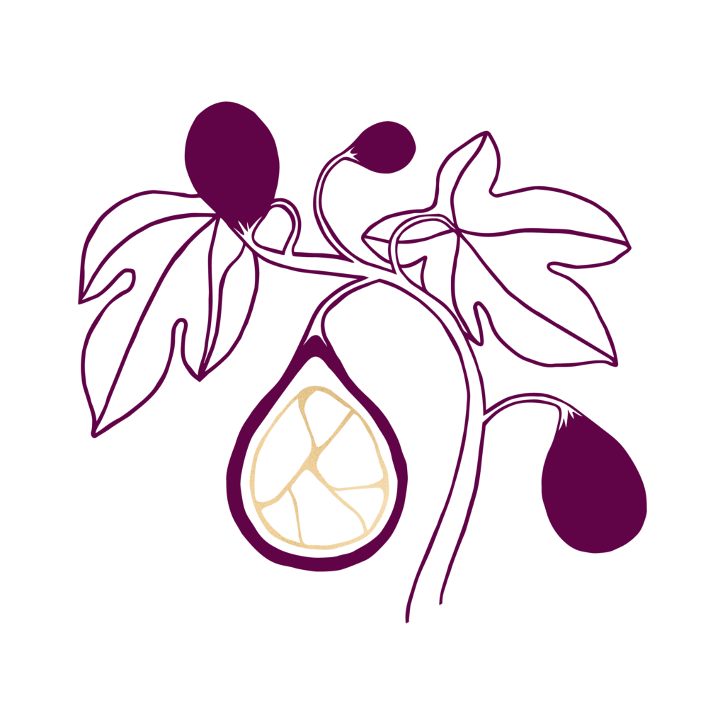
Meg drew inspiration from my notes on the Japanese art of Kintsugi—the delicate practice of repairing broken ceramics with gold lacquer.
The fig and vine leaves symbolise abundance and plenty. Traditionally, the fig represents new beginnings and connections—values I feel especially drawn to in these times. Gratitude for the abundance that surrounds us remains a vital reminder, no matter the state of the world.
Meg took my many ideas and inspirations and crafted a stunning design that perfectly reflects the core values of my sustainable cake business, while also symbolising new beginnings and abundance, making Love From Luisa’s identity truly one of a kind.
Thank you, Meg!
Want to see some of my beautiful wedding cake designs? View my gallery.
